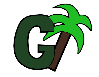
Final Logo

I decided to make my logo very simple by sticking with the "G" for Greenway, and adding the palm tree to show that it is a company that has to do with landscaping and outdoor designs. I chose the two different greens to contrast each other. The brighter green on the palm tree pops against the white background and the darker green inside the letter G. The idea was to make the logo much simpler than the previous logo. I wanted this new logo to be more iconic and visually pleasing.
Original Logo:


Comments
Post a Comment